Wayne Shorter / Emanon
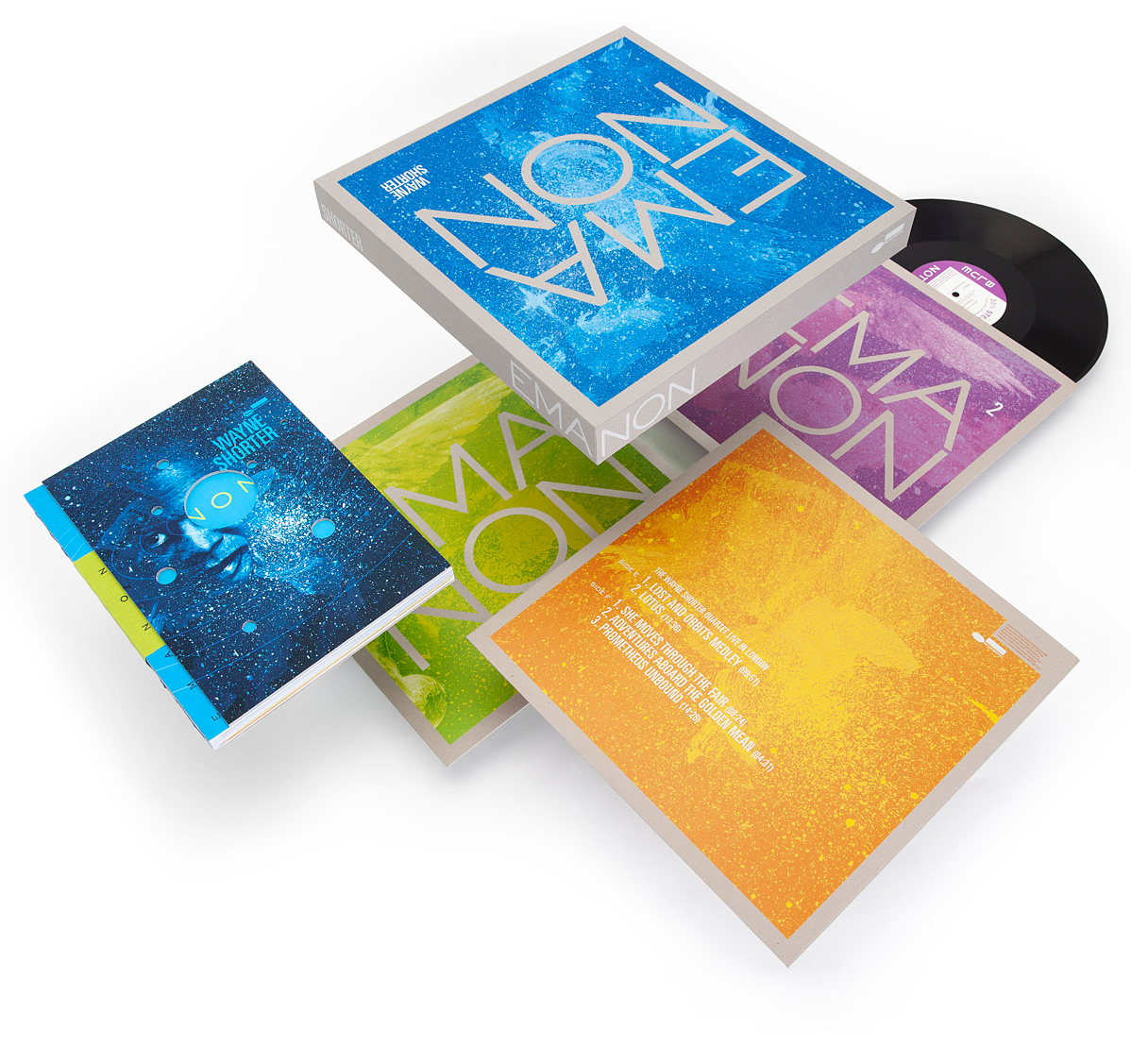
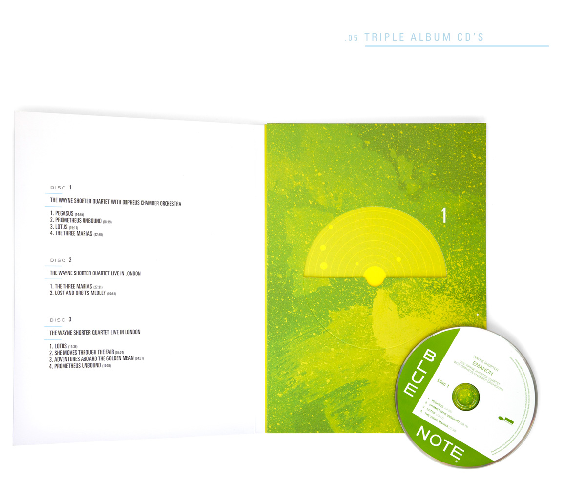
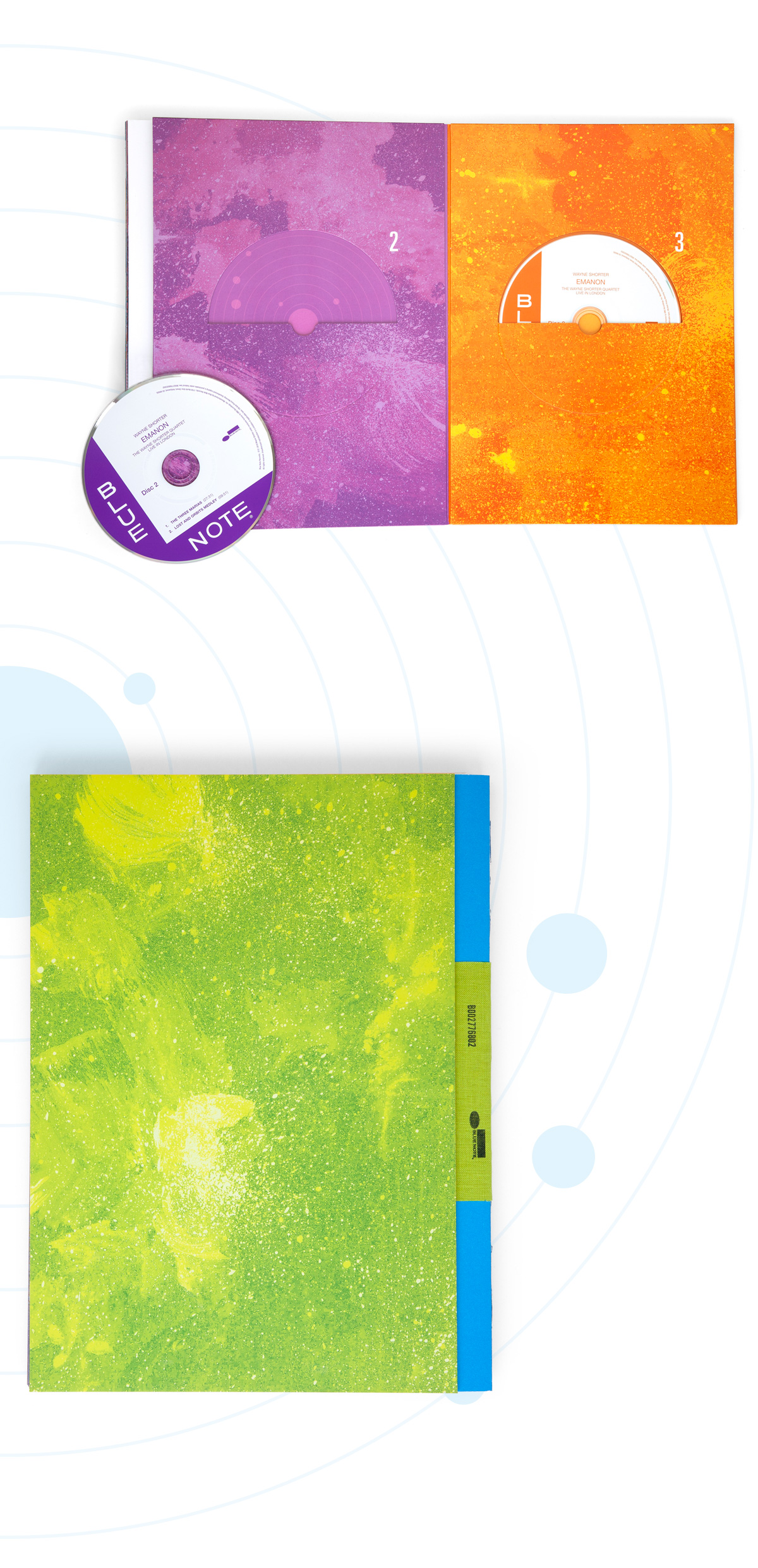
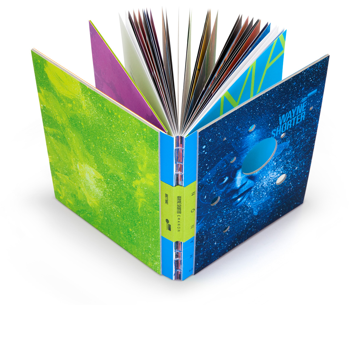
This packaging is intentionally designed to reveal its dormant possibilities as it travels between alternative realities of the multi-verse. Translation: it’s intended to wear and tear. It’s not precious. It gets better with age, just like the jazz master himself. Wayne Shorter has outdone himself with the triple album and graphic novel EMANON. And M+P has embraced his concept of the multi-verse with tactile details throughout to reveal process and texture of alternate realities woven within the music and graphic novel.
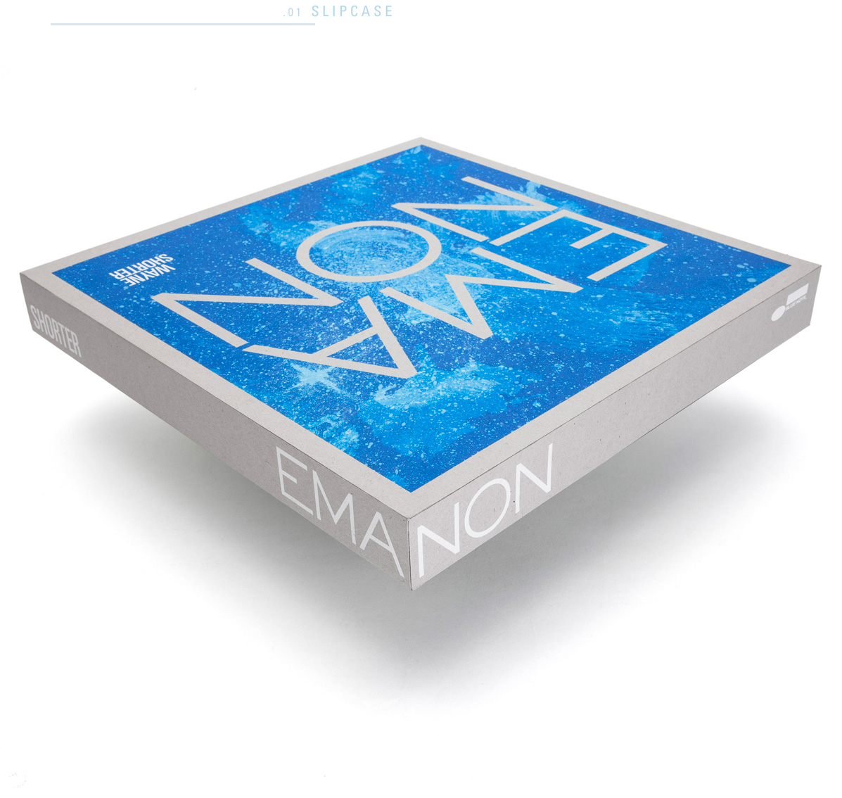
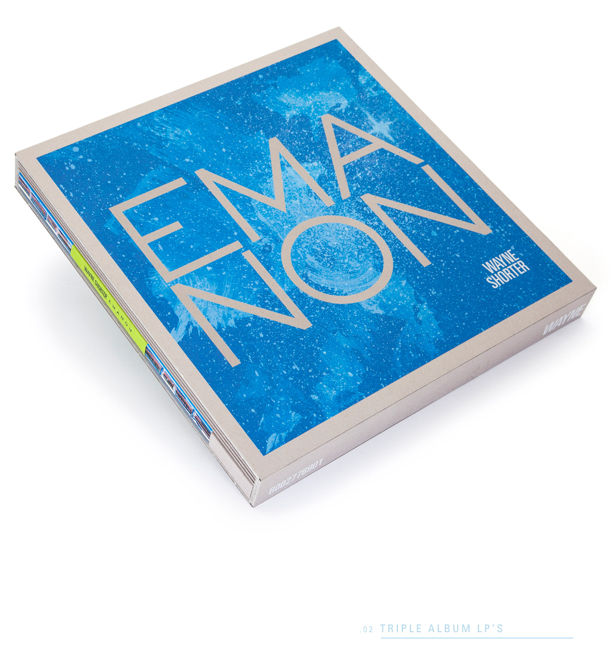
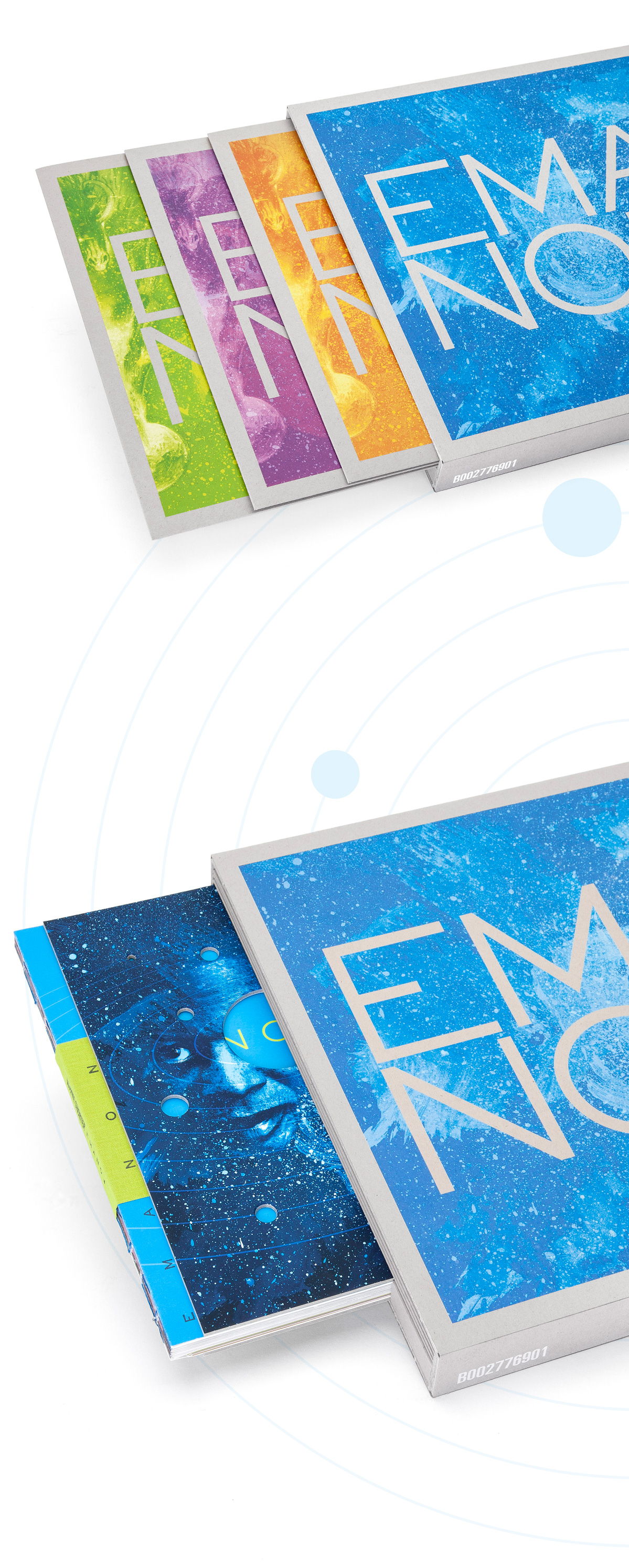
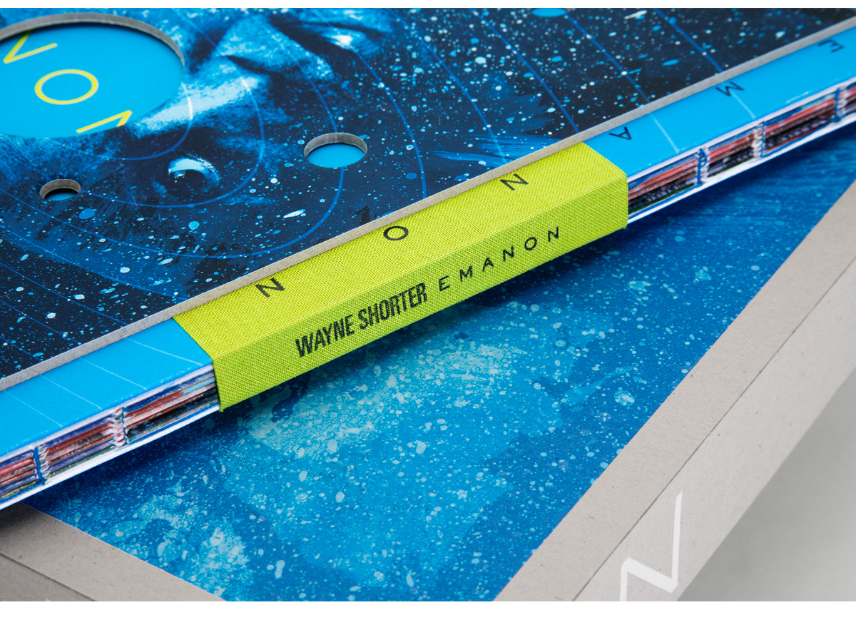
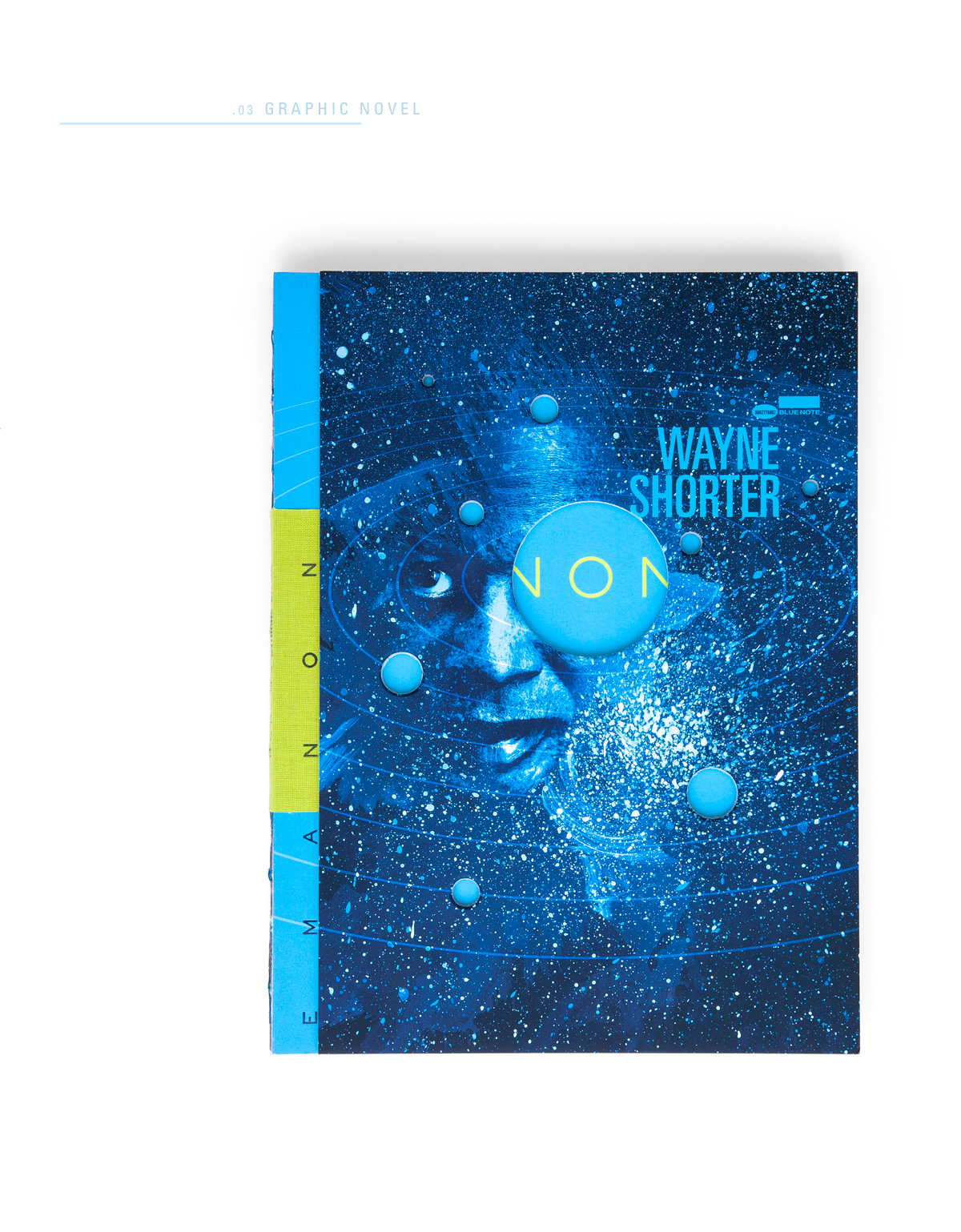
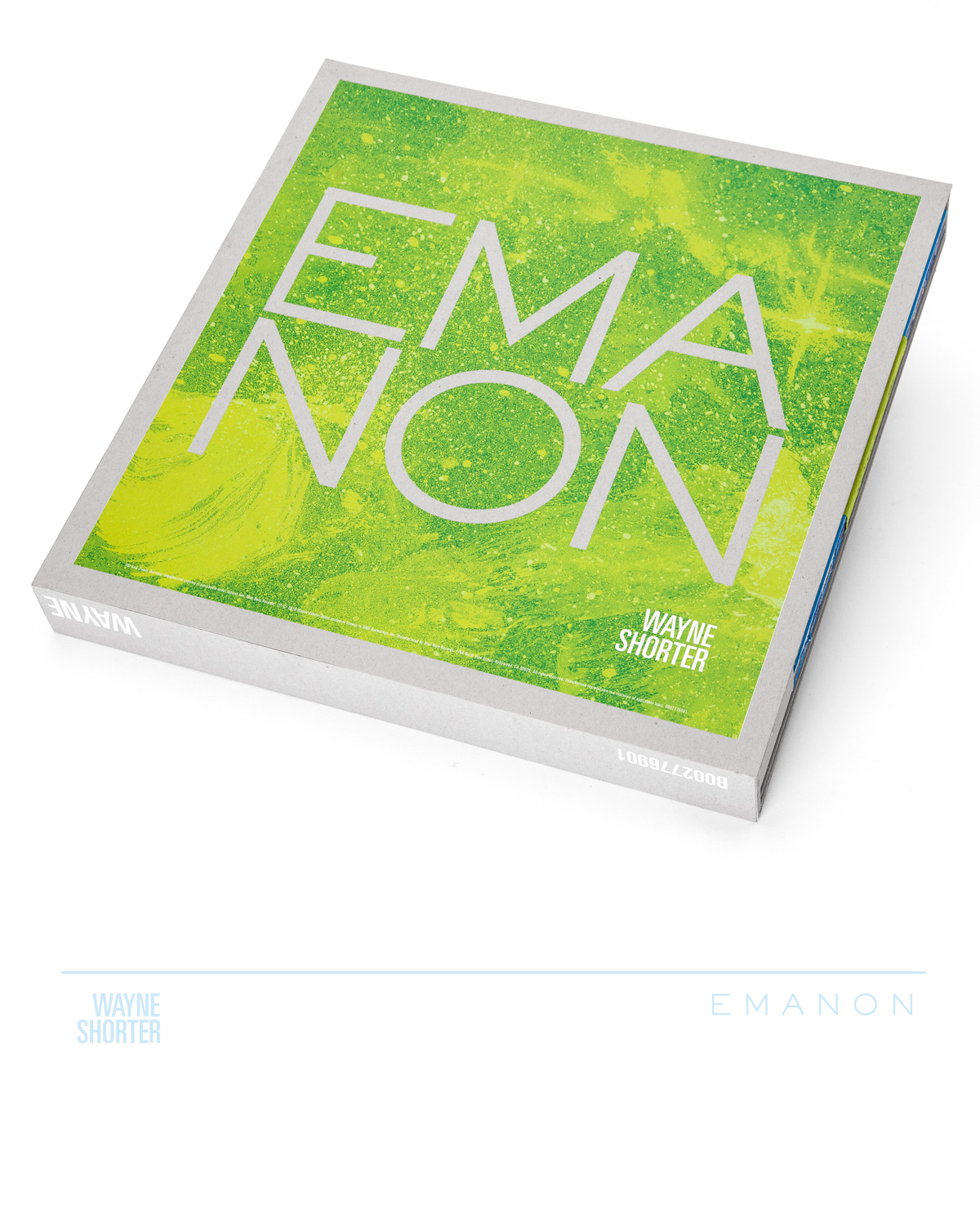
From the double-sided cover, to the three-sided single spine slipcase features, to the books’ exposed smythe-sewn cloth-bound spine, to planetary die cuts on the cover revealing yet another layer within, we’ve gone deep, deep into the concept Mr. Shorter set forth to create.
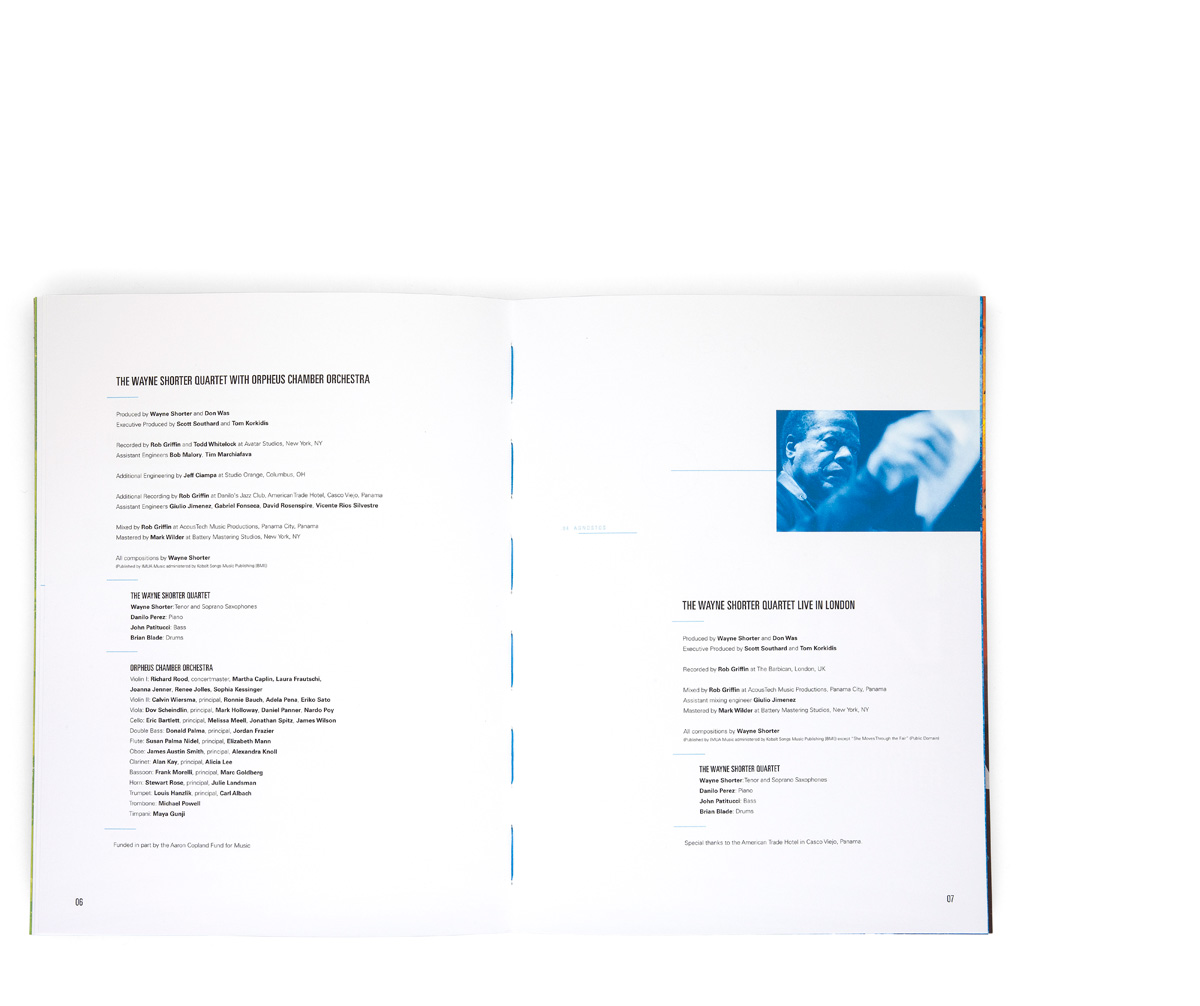
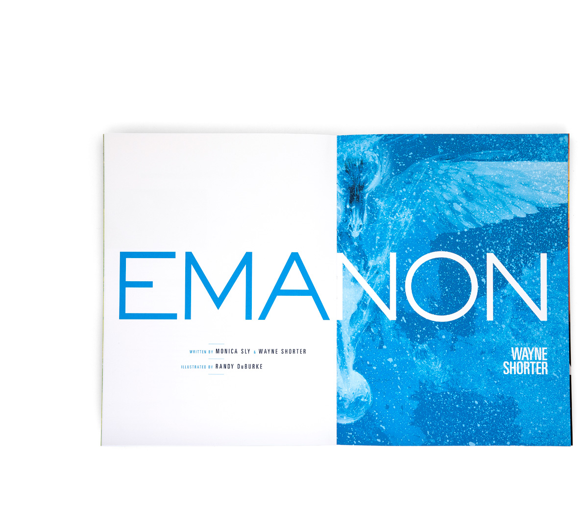
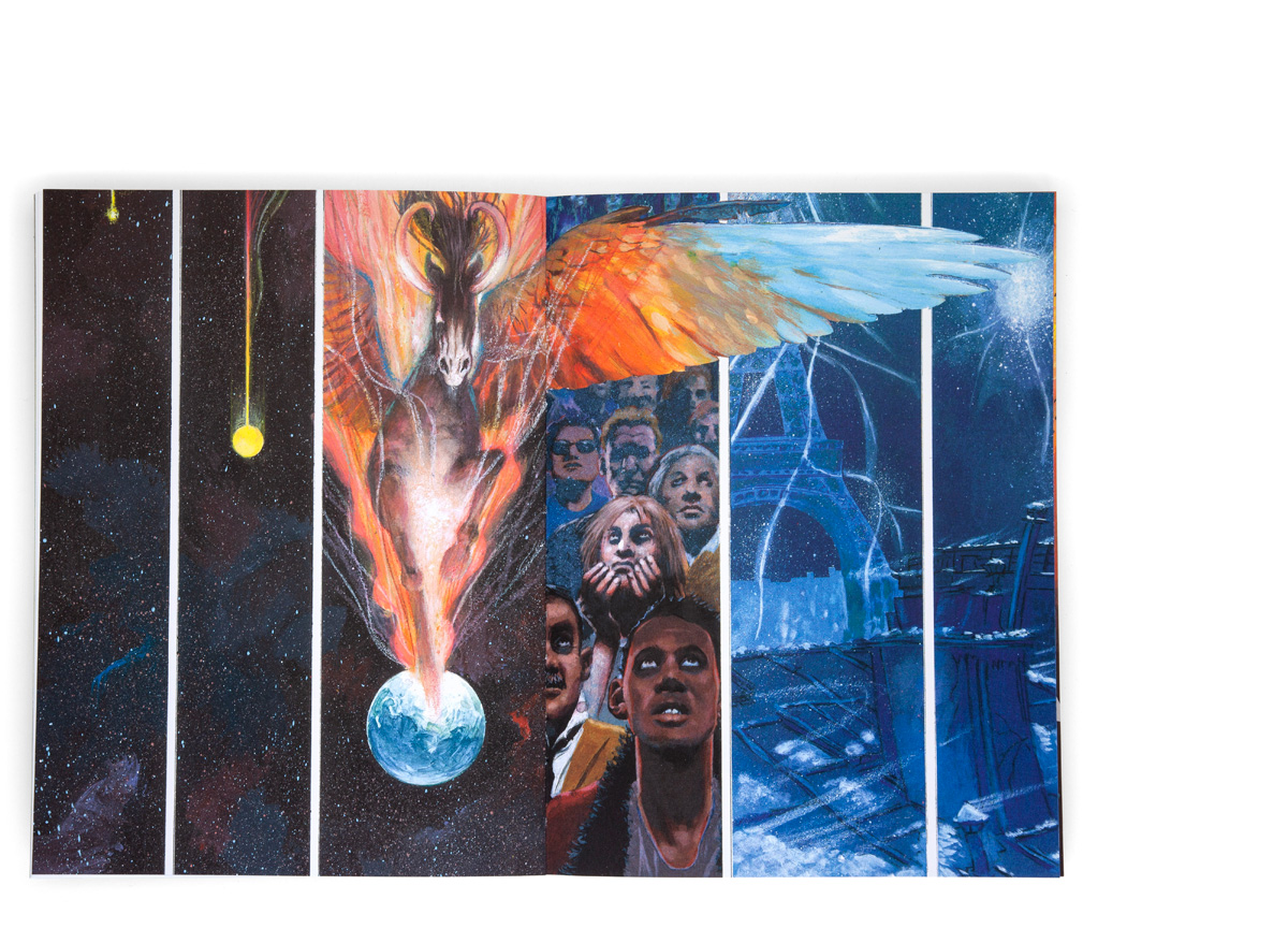
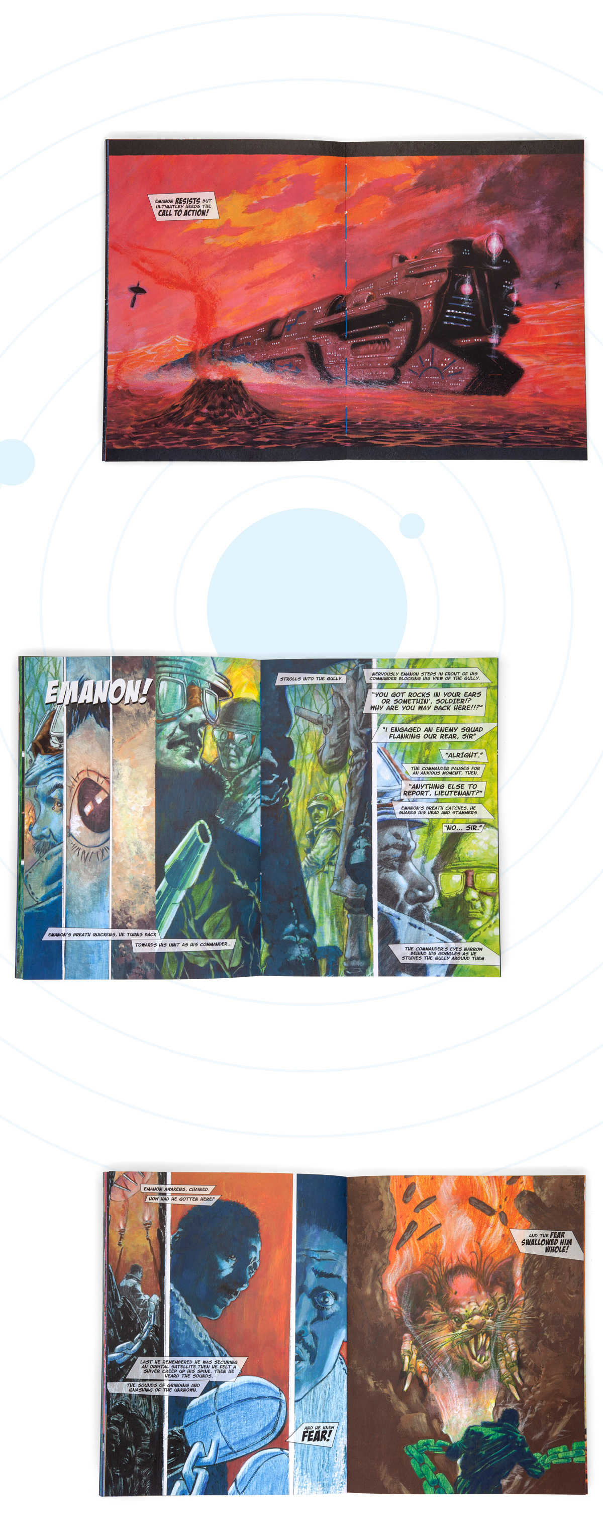
The EMANON experience comes to life when the needle hits the record and the 84 page graphic novel, illustrated by Randy DuBurke, is perused alongside every one of Wayne's ingenuously composed notes.
Our packaging inspiration didn’t just come from the music, the novel, and Wayne, but from a trip to DTLA’s Hennessey+Ingalls with EMANON producer, collaborating Art Director, and Blue Note President Don Was. Browsing the aisles for hours, we ooh’d and aaah’d over an impressive selection of published works, several of which planted the seed for the idea of using raw chipboard and unpolished production methods juxtaposed by smooth and tactile finishes.
///
Illustrated by Randy DuBurke
Cover Portrait of Wayne by Tomo Muscionico
Read the Vinyl Factory interview
